Colors play a crucial role in how we connect with spaces, and the paint color you choose for the walls determines not only how it looks but also how it feels.
Colors have an impact on our emotions to a great extent. Grays are a popular choice, as they radiate simplicity with a fresh and sophisticated feel. Customers tend to pick gray shades like gray cloud Benjamin Moore or shades from Sherwin Williams.
Neutral colors have been the most sought after color choices for the past few years. They are versatile and go with every other color. Gray – the most popular choice for interior painting among neutral colors offers a perfect combo – it is soft, stylish, and provides balance.
It does not overwhelm the room and adds drama to space at the same time. Moreover, it is a pro in complementing a range of furnishing.
Gray colors can also be used to add dimensions to the room. Gray walls and white ceilings look classy and provide personality to space. Roofs can also be painted with lighter shades of gray to create an illusion of a cozy place and make it look spacious. Gray is said to offer a cleaner look than beige, due to the variety of shades in its color palette.
There are numerous shades of gray available in the market, which makes the task of choosing the best gray intimidating. Some are more grayish while others are ‘beige-ish’ or more popularly, they are greige or warm grays. There are cool grays as well, with a blue or green undertone.
Here is the key: you have to make sure the undertones of your gray harmonize with the undertones of interior home elements. Warmer grays are more welcoming and engulfing, while cooler ones radiate modern vibes.
One example of cool gray is gray cloud Benjamin Moore, composed of only black and white pigments. With enough lighting, it looks almost like an icy blue and complements pure white trims well. Gray cloud Benjamin Moore is undoubtedly a fantastic option for a gray paint color with a blue undertone. It will make you feel as if you are levitating in the clouds.
Sherwin Williams offers a LOT of gray paint color shades, so here are some of the best Sherwin Williams Gray Paint colors to help you cut through the clutter.
Sherwin Williams Repose Gray SW 7105
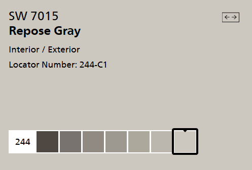
With subtle brown-taupe undertones, Repose Gray is a warm gray that can go with literally any décor style. It has a pinch of purple that softens it and prevents it from looking flat and dull. However, this isn’t the most predictable gray; it can flash a wink purple or brown depending upon where you apply it. Repose Gray can be called one of those ‘miracle colors’ as it perfectly complements both dark and light hardwood floors.
LRV tells us how light or dark the color is, as it measures the amount of light a color absorbs or reflects the room. Colors below 50 tend to absorb more light than they remember. Therefore they’re labeled as darker colors. Colors above 50 reflect more light than they absorb, so they’re lighter colors. Repose Gray comes with an LRV of 60.
Sherwin Williams Dorian Gray SW 7017
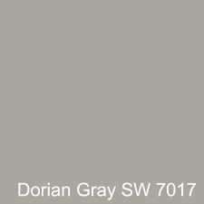
Coming from the same family as Repose Gray, Dorian Gray is a darker gray with almost green undertones. It looks gorgeous when paired with white color. It can look dark in dim lights, but it will do wonders in larger rooms with plenty of natural lighting.
It has an LRV of 39, which makes it a perfectly warm, neutral gray paint tone. Such colors like Expressive Plum or Jasper Stone go exceptionally well with it.
Sherwin Williams Gauntlet Gray 7019

Just like gray cloud Benjamin Moore, Gauntlet Gray is a cool gray with blue undertones. The coolness of this gray makes sure the room doesn’t feel like a cave but looks elegant and sophisticated. It looks great with lighter creams and whites and can be used in bedrooms, living rooms, and bathrooms, as well as the primary body color for exteriors.
Gauntlet Gray can be an ideal choice if you are looking for a gray charcoal color. If you are a fan of white kitchen cabinets, you can use Gauntlet Gray to add a dimension to space beautifully. It has an LRV of 17, so it looks lovely when contrasted with any lighter selection.
Sherwin Williams Agreeable Gray 7029
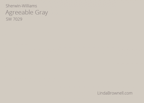
This is an ultimate neutral greige paint color. Since it is a soft blend of warm and cool undertones, it goes with everything. Being Sherwin Williams’s number one selling color, it is loved by the customers because it holds together every other element present in the room from furniture to rugs. Agreeable Gray may look blueish in some cases, but it is considered a warm color.
South-facing rooms make darker colors look brighter, and lighter colors seem like they’re glowing. Thus, a light-neutral color such as Agreeable Gray would suit perfectly in a south-facing room. It can also be used in bathrooms for a fresh and crisp feel.
Agreeable gray has an LRV of 60, and it tends to stay docile. It can also be used for the exterior of your home, but remember that direct sunlight would make it look even lighter.
Sherwin Williams Colonnade Gray 7641

Think of it as a baby of Agreeable and Repose Gray. It is warmer than Repose gray with slightly more brown undertones and cooler than Agreeable gray. It doesn’t give fresh vibes like a typical light color but doesn’t weigh down space either. It is soft and subtle and more of a ‘timeless’ color shade.
Warmer tones can be used to balance out Colonnade gray if used in the main walls. It has an LRV of 53, and southern lights soften it up to give a heavenly feel. However, it becomes difficult to pull warmth out of Colonnade Gray in northern lights. It favors green more, but can also complement other calm colors.
Colonnade Gray is pretty flexible and goes well with white, subdued greige or any other lighter tones. It can also be used as the primary body color or at the front door.
Sherwin Williams Silverplate Gray 7649
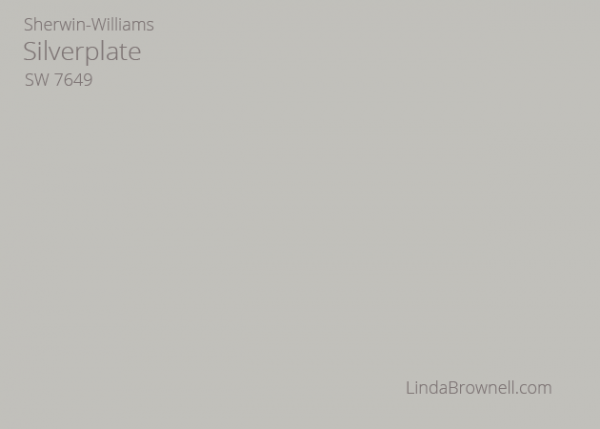
Another neutral gray color, Silverplate gray flashes blue-green undertones and looks stunning as a backdrop of any accent color. It has an LRV of 53, making it look a bit heavy for dark rooms. It seems cleaner and crispier in a well-lit room. When paired with marble tiles and white cabinetry, Silverplate gray looks just flawless.
It tends to favor green, so green becomes an excellent option to be used as an accent color. Using Silverplate in bedrooms gives a refreshing feel.
Sherwin Williams Big Chill 7648
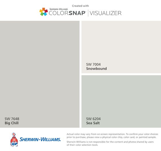
Compared to the gray cloud Benjamin Moore, Big Chill has a slightly less green-blue undertone, which makes it a calmer typical gray. It doesn’t wash out in natural light as light colors tend to, but it doesn’t feel heavier too. It lies right in the middle and thus can be called the ‘perfect’ gray. It has cool undertones, but it isn’t as flexible as other neutral gray colors.
If you have trees or grass outside your window, Big Chill might pick it up nicely. It has an LRV of 62, making it a lighter shade of gray.
Sherwin Williams Worldly Gray 7043
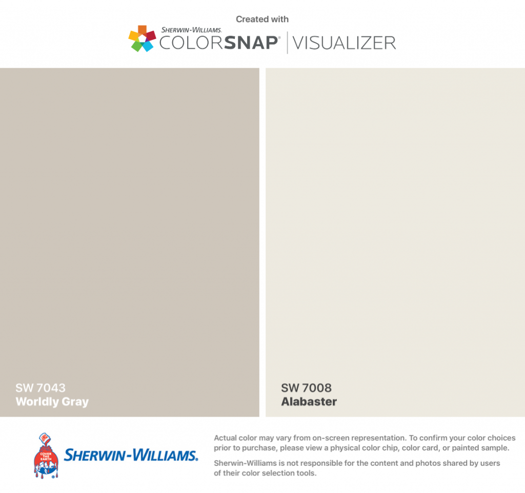
Worldly Gray is less warm than Agreeable Gray, but it doesn’t feel too cold and icy either because there are no blue undertones involved. It bounces light around well while maintaining a modern styling. Its warm undertones tend to come forward with no natural lights. Unlike the gray cloud Benjamin Moore, Worldly gray feels warmer most of the time. It has an LRV of 58.
0 Comment
https://potofu.me/pd0v6d5u https://beta.cent.co/lost1587/+ln4aky https://gratisafhalen.be/author/lost1587/ https://www.bourse-du-sport.com/author/lost1587/ http://www.annunciogratis.net/author/lost1587