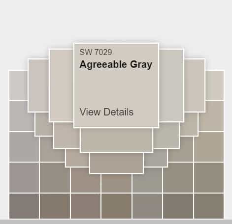
It is almost agreeable for most of the people that ‘Agreeable Gray’ is one of the most complimentary colors. It is one of the Greige colors, i.e., combinations of Gray and beige. It is soft and primarily a warm color with a greater number of warm undertones than cooler. On a scale between Gray and beige, it is a tad closer to Gray and has residual beige shades.
Agreeable Gray
This color is like the Revere Pewter color that is in between Agreeable Gray and beige but a tad cooler. If Agreeable Gray were to shade up a bit and mix some blacks and blues, it would become Revere Pewter.
They are closely related and can be called brotherly in terms of the closeness between shades. Agreeable Gray is warmer and reflects more light than Revere Pewter Paint because of the lightness and the dark undertones.
Tones, Tints, and Shades in Agreeable Gray
Like Sherwin Williams’ other shades of Gray, this Gray has undertones of various sets of colours. Gray’s exist from off-white colours to almost black colours. From the white-end to the black-end, there are lots of warmer and colder colours. The tints (colours mixed with whites), shades (colours mixed with blacks), and tones (colours mixed with Gray) of Agreeable Gray look classy and premium as their other neighboring Gray’s.
Beige and Taupe
Beige and Taupe undertones are most evident in Agreeable Gray and the similar Revere Pewter Paint. Both the colours have warmer hues of Beige & Taupe, and a slight modification in shades of beige and taupe can generate Repose Gray, Agreeable Gray, and Revere Pewter Paint.
Repose Gray
Repose Gray is the nearest neighboring color between Agreeable Gray and Beige. It is closer to Gray than agreeable Gray, which is more greige. Repose Gray is a bit cooler than agreeable Gray, and there is a bit of lavender in the undertones.
Alpaca
Alpaca is darker than agreeable Gray, Repose Gray, and revere pewter. It is way darker, and the saturation is more relaxed compared to other Gray’s.
Worldly Gray
Worldly grey is way towards a beige in the scale of Gray’s from Repose Gray to Beige. This shade is warmer and close to the darker off-white undertones.
Reflections!
The Light Reflectance Values measure a color’s warmth and cold. LRV is the reflection rate; the LRV of White is 100, and the LRV of Black is 0. As black does not reflect any light, it is LRV is zero, and White bounces any light.
Gray’s LRV value is 60, and it is somewhat in the middle of the scale. In comparison, Revere Pewter’s LRV is 55.5, significantly closer to the agreeable Gray. Both the identical Gray’s reflect a decent amount of light, and that is neither more nor less.
Its LRV suggests that this is the Greyest of all Gray’s. Gray is a pure mixture of total white and absolute black. Hence, a colour having LSR around 50-60 is considered pure Gray!
Agreeable Gray and Revere Pewter Paint have LRV ranging from 50-60, making them the purest of Gray’s. They are perfect neutral Gray’s!
Undertones
As the LRV range is neutral, the undertones of Agreeable Gray and Revere Pewter Paint have neutral undertones. Agreeable Gray looks warm because of its taupe and brownish undertones. They also look equally cool, given the right natural light.
This coolness in Agreeable Gray is because of the violet and purple undertones it gives out. Even its undertones, hue, saturation, and shades are perfectly balanced, making it perfect, and the Gray that is agreeable!
Lighting Conditions
Any colour looks different in different lighting conditions. In a well-exposed room, peach may give out orange. Similarly, all the shades and tints of Gray give out undertones of blue, purple, and green.
You can observe different undertones in different types of lighting conditions. In a subtly lit room, Agreeable Gray might throw out as a shade of blue. Even though it is primarily warm because of its LRV, it can still give out cooler shades.
You can see the balanced and soft colour of Agreeable Gray that balances all the hues in a decently exposed and well-lit room. This balanced and smooth colour appears out as a middle tone between Gray and beige. That is why it comes under the list of all the other greiges!
Saturation
To know if this colour is hot, you need to compare it with the other paint colours. One confusing thing about Agreeable Gray is that if you choose a relatively warm colour, the Agreeable Gray looks cooler in comparison.
Similarly, if you compared it with a rapid cool paint colour, it seems warmer. The neutral undertones and hues play the culprit here. If you are looking for the warmer colours of Gray, you should also check the colours of objects and items placed before these walls.
If there is an object which is warmer than Agreeable Gray, your walls suddenly feel desaturated. It is up to you to decide how you want your paint colour to feel. But regardless of the lighting conditions and comparisons, Agreeable Gray as a paint colour is warm because of the beige undertones leveraging a bit more than Gray’s.
Best Suited Areas to Use the Colour.
Agreeable Gray has a premium finish and can be a good fit for exteriors. But you can use them anywhere you want with specific customizations and the colours of the objects you place in front of them. Most people who have used agreeable Gray used the colour in interior and exterior parts equally. Let us discuss what parts of the houses do people paint Agreeable Gray.
Exterior
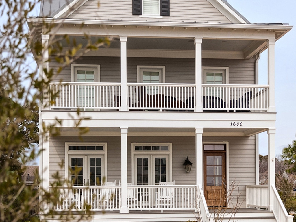
Exteriors are a good fit for Agreeable Gray because they are not too dark and not too bright. They are subtle, modern, and futuristic—the houses whose exteriors have Agreeable Gray look classy and high-end.
Ceilings
Ceilings are usually the most avoided parts of the house. Most people do not usually think about these trivial parts and paint it white or off-white. But they play a significant role in making a room look good. As Agreeable Gray is neutral paint colour, it matches almost any colour. If you have different colours on your walls, this colour will match them because of the balanced combination.
Kitchen
Kitchens are the place that needs the right environment and an equally good mood. A chef in a bad mood can make a stomach upset. Regardless of mood and color psychology, a kitchen that has Agreeable Gray looks suave.
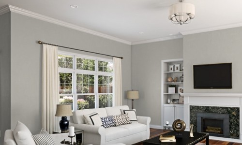
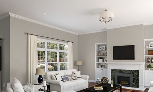
Living room
Living rooms are the places where people sit or do activities in the day. Having an agreeable coat in the living room gives a balanced mood, keeping the environment look classy to the guests.
Bathroom
Agreeable Gray is an excellent fit for bathrooms. Many classy hotels make sure their bathrooms are shades of neutral Gray. The ceramics and steel taps look incredible with agreeable Gray, Repose Gray, and revere pewter paints. If your bathrooms are painted with white or off-white, you can still have your cabinets in Agreeable Gray because they look so good together.
Cabinets
Cabinets are those things that are in the middle of you and your wall. Regardless of what the color of your wall is, Agreeable Gray cabinets are a perfect match—the cupboards, coffee tables, and even dining tables with Agreeable Gray look fancy.
Struggle for an Identity!
Repose Gray, agreeable Gray, and revere pewter are the paint colors that look almost similar. The only differences in those colours are undertones, LRV, and shades. One can confuse all the three as the same because of the striking similarities. If placed together, you can see the differences, but you cannot name them without the labels.
Revere pewter’s LRV is at 55.5, Repose Gray’s LRV at 50, and Agreeable Gray’s LRV at 60; they are so close yet so far from each other. They all belong to the neutral Gray club, but their associations with beige make the difference. Comparatively, Agreeable Gray is closer to the beige than the other two. Unlike evident purple undertones, the other two, Agreeable Gray, have less to no purple undertones.
Final Words
After looking at all the aspects of Gray’s and their comparisons, it is more than evident that Agreeable Gray is the best Gray! The undertones, hues, saturation, and Gray tints are so perfect and soft that it makes the most complementary color.
People look at this color twice because it makes an impression. If you want to go for Gray’s and are sad because of the desaturated look, Agreeable Gray is here for you, the best Gray there is!
Its striking similarity with repose Gray and revere pewter makes it tough to choose one among them, but the optimal solution would be to pick Agreeable Gray. For people interested in modern-looking, balanced, and soft colors, they should go for Agreeable Gray!