This paint colour from Sherwin Williams, a paint manufacturer, is one of their multiple shades of Gray’s. It belongs to the family of mid-tone Gray’s and just a tab darker than Repose Gray.
One can confidently paint this Gray on its main walls. The mid-tone Gray, which lies between off-white and darker Gray, is the best solution if you want to tone down all the warm colours. It falls in line with the requisite Gray.
Considered as one of the warmer Gray’s, it appears calm when painted on walls. The classy finish and tone downs make it look like those rich houses in vintage TV shows. Let us explore all the qualities and overview of this Mindful Gray!
Mindful Gray
Mindful Gray is like Requisite Gray closer to the beige-is undertones. Just like the agreeable Gray, even mindful Gray is one of the neutral tones of Gray. It falls in the range of pure Gray’s that are a mixture of all the balanced shades. But it falls short of a few tones and is one of the beginning shades where the Gray palette starts. The Gray’s that are towards beige are warmer, and the ones away are cooler. Mindful Gray and Requisite Gray are far beyond the beige but still have minimal greige undertones.
Combinations Involved
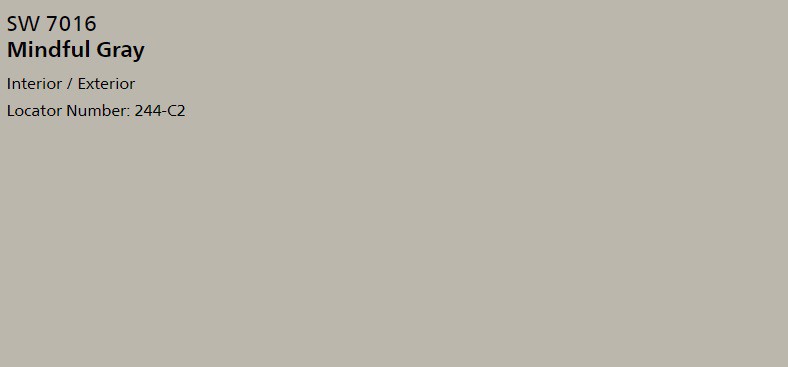
As we know, many colors combine to form a specific color. The primary colors are red, green, and blue. White and black are sort or washed out and dipped-in results of all the colors.
Something too white is just a washout. Something black is too thick. All the other colors are somehow the combinations of RGB and the results of weird fusions. Gray’s are a fusion of white and black.
The palette of Gray’s occupies the middle part of the color wheels. It is because Gray is a result of white and black that are at two extremes. Mindful Gray and requisite lie at the beginning of this Gray color palette.
The combinations involved in Mindful Gray are a bit weird. The blue shades and light oak-is warmth make it look like a perfectly balanced color. But unlike Agreeable Gray, it is not an entirely neutral Gray. It is more of a blue-is tint added to toned down oak-is color.
Warmth and Cold
Usually, Mindful Gray and requisite Gray give out warm tones if you look at them digitally or on paper. But when painted on walls, the blue-is undertones inside them make them a lot cooler than you expected.
But this cannot be considered just as a cooled-down Gray.
Because if you cool the Gray down and compare it with Mindful Gray, you will find the mindful Gray to be warmer than the cold Gray. This difference is because of the equally balanced beige undertones. It might not be evident, but this color belongs to the greige color family.
Lighting
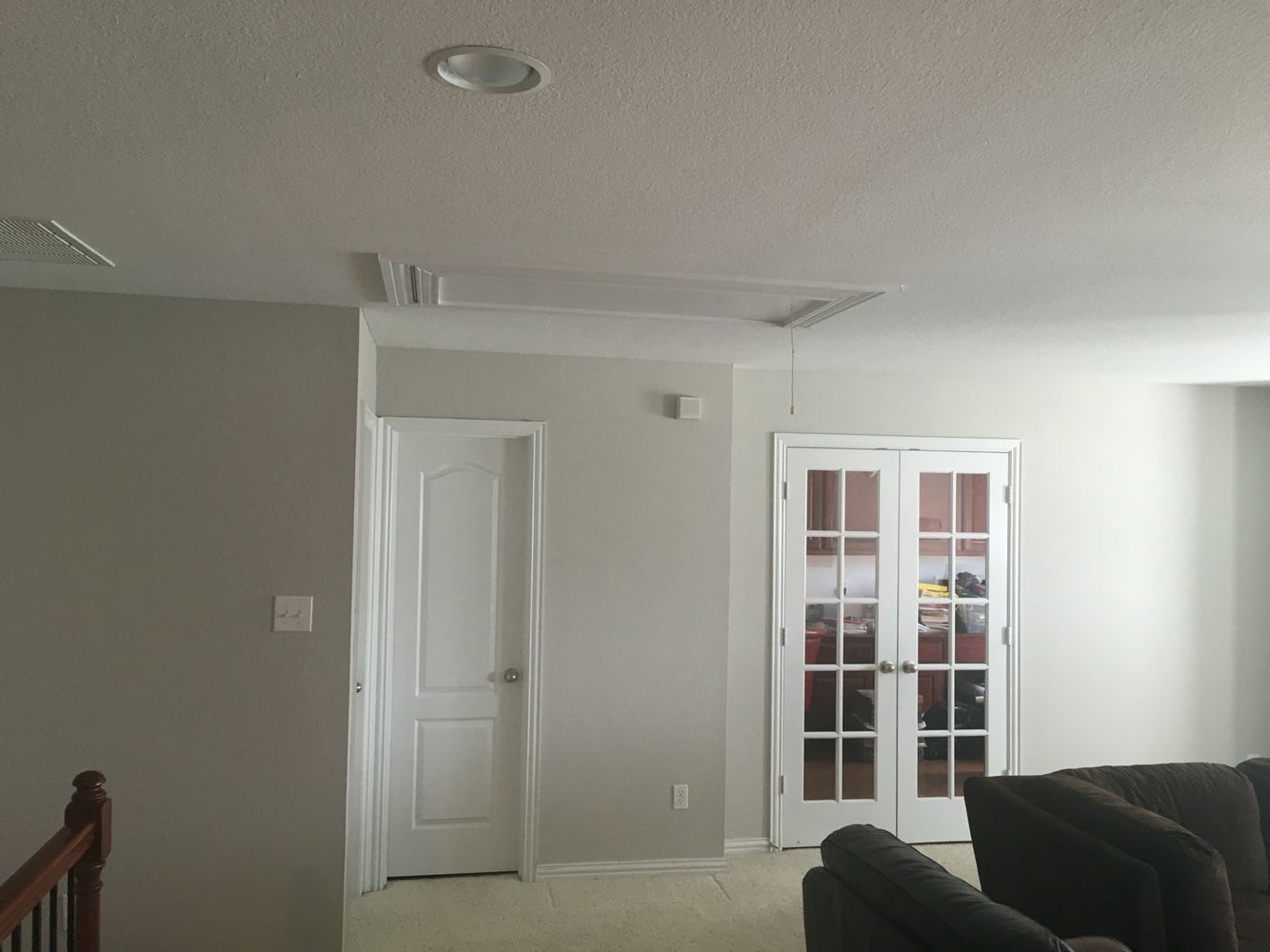
Lighting always affects the look of paint color. Mindful Gray appears to be cool in a dark room, and the blue-is undertones elevate over the warm beige undertones. As mindful Gray is closer to the blues than browns, it is natural to have the wall look cooler in dark areas.
It might give out as Agreeable Gray or even darker Gray’s such as repose Gray. It is a lot darker than Alabaster’s Gray. Alabaster Gray can pose as Mindful Gray if it is applied thick.
It appears as a different color in a well-exposed room where the sun’s yellow and orange lights hit those Mindful Gray walls.
The reflective nature of Gray (because of the white undertone) reflects those orange-is rays of the sun and look warm. You can see the warm, mindful Gray you have seen digitally or on paper when the room is entirely lit by sunlight. This warmth happens because of the beige and warmer undertones present.
Partners in Aesthetics
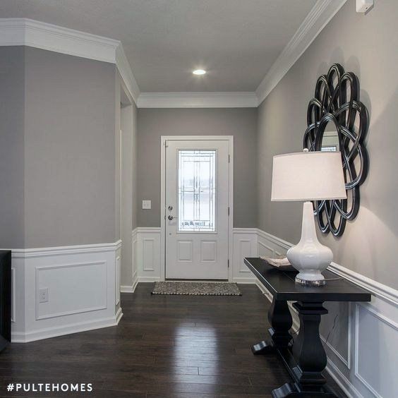
No color goes single; they need another color to create a contrast and look aesthetically pleasing. Like every other color, even Mindful Gray and its twin requisite Gray need another color that goes hand in hand with them.
This search for a combination is much needed because if you want to paint mindful Gray to your ceiling, the wall paint should contrast with the ceiling giving out a dramatic look. Primarily, the Gray’s that are blue-is and cool make the right partner for both mindful Gray and requisite Gray.
Eider White
This specific colour falls under the family of off-white and can make a good contrast in front of Mindful Gray. The undertones of white and cold saturation make it a great fit.
Pearly White
Pearly white is even lighter than Eider white and can make a good team up with Mindful Gray. This colour is warmer than Eider white and looks like washed-off Mindful Gray.
Homburg Gray
This paint colour falls on the darker edge of the Gray colour palette, the other extreme of Mindful Gray. If these both are two extremes in the colour palette, then they make a good fit without a doubt. Extremely opposite colours always make a great fit!
Riverway
This colour has the undertones of blue and green. It looks like thick Mindful Gray with more blues and greens. Like Homburg Gray, it makes Mindful Gray look lighter, as light as off-white. It is an excellent combination as Riverway is colder than Homburg Gray in saturation.
Naval
It has more blue undertones and is at the extreme Gray edge, which is bluer than Gray. It cannot be called one of the Gray’s because it falls in line with navy blues. Its saturation is cold and has almost no warmth even after coating it to the walls.
The light reflection is also low, and it makes a perfect combination with Mindful Gray and requisite Gray. If you have Naval colored walls, Mindful Gray becomes a good option for your ceiling or properties around.
Highlights of Mindful Gray
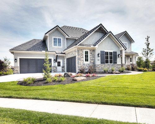
Mindful Gray is primarily a warm color, yet it does not appear too warm when coated on walls. And that happens because of the blue undertones it has. The undertones of blue and green make it look cooler at certain lighting conditions.
This quality makes it join the team of neutral Gray’s that balance both the saturation. It can look bluer in dim-lit environments. It is near to Repose Gray and falls on the same palette as requisite Gray. Wooden tones look lovely in front of Mindful Gray.
Cabinetry
The most beautiful fit for this color is cabinets. This color looks darker than white and a color that looks fabulous for any cabinets. White cabinets are a cliché and not a good fit if you have warm colors. Off-white cabinets are cool but cannot match all kinds of wall colors. But Mindful Gray’s off-white undertones mixed with blue and green undertone undertones make it a good match for almost any wall colours.
If you have cold coloured walls, Mindful Gray either mix in with them or appears a bit warmer in front of them, given their saturation intensity. Similarly, if the walls are warm, Mindful Gray either get mixed with them or seems cold, giving out a contrast given the saturation intensity. This mixing in with any of the colours happens because of the balance’s undertones.
Other Places for Mindful Gray
Cabinets and furniture are the top preferred areas to paint Mindful Gray and requisite Gray. But the other sites that look good for Mindful Gray are exteriors, living rooms, bedrooms, and drawing rooms.
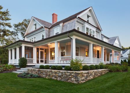
Mindful Gray is a fine choice for exteriors because of the balanced finish it has. Living rooms and drawing rooms exist to entertain the guests, so a paint color that looks a tad warmer would be welcoming. It is also the best thing to paint Mindful Gray on ceiling and roofs because it matches almost any non-vibrant colors.
Wrapping up
Mindful Gray is called neutral because it is not too much beige or not too Greyish in appearance. It has undertones of greige, but even that is not evident enough to identify. Unlike other neutral Gray’s, Mindful Gray is a bit warmer and closer to off-whites because it is at the extreme Gray palette’s edge. This position makes it easier to get confused with the requisite Gray of other off-whites.
It would be best if you had a look at it physically than on screens or paper. Please check out painted rooms or small samples. It might look different if the mixing is not done correctly. Mindful Gray, because of the balance of many undertones, can get off as a different shade if it gets too thin.
It is always best to look at physical samples to judge a color as balanced as Mindful Gray. Gray’s are hard to choose, and neutral Gray’s make it even challenging to differ and pick.

0 Comment
https://uctgjkfkfi.wordpress.com https://jdhztcuspt.wordpress.com https://irftjdidas.wordpress.com https://pqtuaywikd.wordpress.com https://rjzdippase.wordpress.com