Sherwin Williams is one of the most popular brands that manufacture paints worldwide. They are popular widely for their menu. They offer shades and tones of colors that you did not even know existed.
And Alabaster is ranked as one of their best-sold colors. People who review the paints call it the best exterior gray color offered by Sherwin Williams. They offer extremes, neutrals, and even subtle tints in almost every color.
Neutrals are beautiful. When painting your house, nothing can match the look of neutrals. Thinking about neutrals, I cannot go without telling you about Sherwin Williams’s color of the year 2016, Alabaster (SW 7008).
Like the other neutrals, Mindful Gray, Agreeable Gray, and Requisite gray, even Alabaster makes a perfect neutral closer to off-white. It is also one of the best exterior gray colors of Sherwin Williams
Colour of the Year
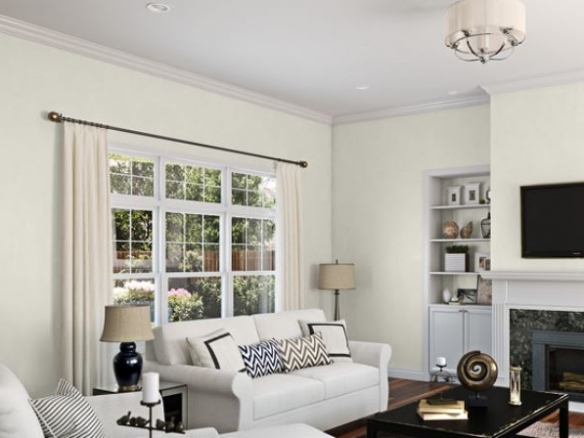
Sherwin Williams Alabaster is a neutral shade, an off-white color which is an indication of solace and peace. As it is an off-white color, it is perfect for all our background highlights. It allows your home decorations to look great on the walls.
Also, it gives a classy touch to your rooms. Using neutral colors will be a great advantage if you like putting things on your walls.
Alabaster is a soft, almost off-white paint color. As it has the right beige undertone, it gives a creamy touch without over happening the creaminess and yellowish shade of the paint. It provides a warm touch to your house.
Lighting
While painting your home, light plays a significant role as it decides how the color looks on your walls. So, one should always choose the color for your home only after selecting the lighting. If you do not put proper lighting for your home, the color may vary from what you expect it to look on the walls. So, facing plays an essential role in deciding the lighting of your home.
Say a room is north-facing, lighting is mostly bluish and cold. Light colors are not an excellent idea for this type of place. Instead, a bold color can make a better statement. Alabaster is a light color. So, it might not pull off as expected.
Say there is a South-facing room, it will have consistent brightness throughout the day. As there is constant lighting, the darker tones will look like they are overdone, but the light colors glow. The warm shade of yellow comes out, making Alabaster use as the best paint for your south-facing rooms.
Say an east-facing room is painted with Alabaster, it will look great because of the room’s orange-yellow lighting. The lighting is orangish, making Alabaster one of the best tones.
Say if the room is west facing, the brightness is low in the mornings, making Alabaster, not a suitable color to use. But during evenings, the lighting is high, so the look feels excellent.
Alabaster can give an excellent look for your shiplap.
As the warmth of the color goes with any room, it fits right to your shiplap. Though some people hate white, Alabaster is not white, so you can pretty much use it for your shiplap, which looks excellent with the cream-ish tone.
Reasons and places to paint Alabaster
Alabaster is undertoned with beige to make it look creamier. The creamier and the off-white tone makes it a very relaxing color. When you enter a room, the look of the place makes you feel different.
Say if you enter a white painted room, you instantly become calm. That is because every tone has its voice. Let us say you use pinks in your bedroom; it shows what person you are.
Alabaster can be used in schools to create a calming environment among the students and a relaxed mood to make them feel better.
Using Alabaster for your ceilings can also be a great idea as the ceilings are mostly white. Still, when you use an Alabaster tone, it will make it look warmer and appealing. You can also use Alabaster on trims, mouldings, and cabinets.
Alabaster on the Exterior
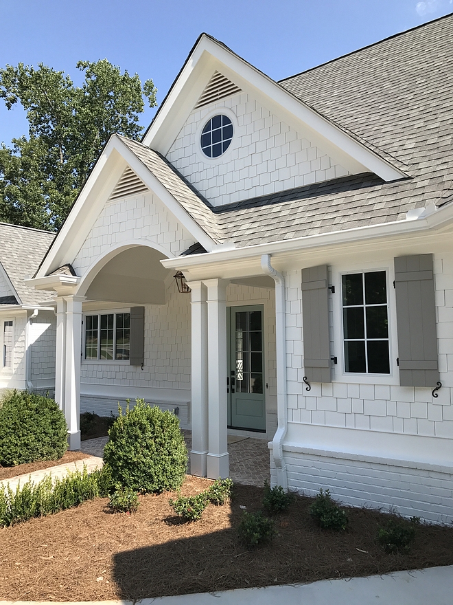
The answer is yes. Due to its warmth and under toning, it looks incredible in the brightness and lighting. It goes with every color, which makes it more usable and paint worthy.
Using Alabaster with darker tones can be a perfect match because of its light toning. It will look more creative and crispier. When you use a darker shade than Alabaster, it might not bring you a better effect than Alabaster.
A Comparison with Neighbours
You might see a lot of colors that look precisely like SW Alabaster 7008. Still, the fact is every color is different and undertones with different colors, making it look variable under lighting conditions. SW Alabaster 7008 has a light reflection of 82, making it look neither less nor warmer.
Also, while many other off-whites have pink toning, SW 7008 has beige toning. The yellowish tone is a little higher when compared to pure white, and the color looks bright and glowing under massive lighting and cold and calm under low lighting. It has a perfect touch of serenity and creativity. When used with darker hue colors on the exteriors, it gives you a matchless look.
Sherwin Williams’ other shades have different lighting reflections making SW 7008 different from them. When used with the right combinations, it has an effect that comes with no other color. Sherwin Williams 7008 cannot go wrong on any wall.
More Ideas to Use Alabaster

Even though Alabaster is one of the best exterior colors by Sherwin Williams, it can also be used in different other areas. You can use it in bathrooms, spas with any bold styling like stripes. Too many stripes may make your room look like a zebra crossing. Instead, use it on one wall and make a classy statement.
There is one best thing about using whites in your rooms that are using home decors. Use any decor, and it will enhance the look of the room. The decors designed with mandala arts are my favourite that can be used. The colors like teal, pink, brown, and black will go best with the room.
You want your bedroom to seem classy and stylish? Then Alabaster can be the best Gray paint you can use. The Grayish tone will give you an aesthetic look making it calm and refreshing.
The living room can be painted with Alabaster, and the combinations like dark Gray and blushes will make it more empowering.
If you are planning Alabaster for your kids’ rooms, then using it with decors like shapes or funny decors can be significant. You can use the white wall to your full freedom as every minute detail will show off clearly.
LRV
LRV is the rate of reflection. If light gets reflected more, it has a higher LRV, and if not, it is dark. White has an LRV 100 because it bounces all the light that hits. Similarly, black is the extreme opposite of white and reflects no light if it is pure black. Hence the LRV value of pure black is 0.
All the Grays are a combination of white and black. Therefore, they fall somewhat around 40-60 LRV. The grays that are near 40 LRV are darker and colder than the grays that have LRV more than 50.
Alabaster has an LRV of 82, which is almost closer to white by 18 digits. It has all the undertones of off-whites and can even resemble eggshell whites in appearance. Because of the high LRV, it bounces off more light and looks like white in a bright room. Its beige undertones make it look warm, and it has only subtle traces of cooler colors.
Overview of Alabaster
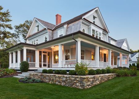
The reviews online are all favourable for this color by Sherwin Williams. Hailed as one of the best exterior colors of Sherwin Williams, Alabaster is that creamy white you feel pleasant to look towards.
Falling far off from the Gray’s bridge, Alabaster also stands on the white color palette’s edge. It is bright, warm, and reflective, but it still is balanced because of the creamy undertones of browns and beige.
Because of its bouncy nature and the LRV, it looks excellent on exteriors. People in hot and humid climates prefer to use bright colors to reflect the heat away. Alabaster does that job pretty much efficiently and adds aesthetic value.
If you love the classic vintage buildings, you will love the finish of Alabaster. It throws out as one of the colonial houses because of its creamy undertones and dominant white shades.
Wrapping Up
Choosing off-whites is a tricky thing to do. Especially the off-whites that are closer to beige. If you are looking for a white that is not white and an off-white that is not off-white, Alabaster is your pick!
The creamy finish makes it look warm and soothing, and the dominant white undertone makes this color highly reflective. Being reviewed as the best exterior colors of Sherwin Williams, it is the best-used exterior for its high-end look.
0 Comment
https://potofu.me/pd0v6d5u https://beta.cent.co/lost1587/+ln4aky https://gratisafhalen.be/author/lost1587/ https://www.bourse-du-sport.com/author/lost1587/ http://www.annunciogratis.net/author/lost1587