This piece is about Benjamin Moore’s one of the best-selling and most popular greige paint, Edgecomb Gray HC-173. We shall delve into Benjamin Moore’s Edgecomb Gray HC-173, analyze it, review it, and compare it with some other colors. So, without any further ado, let us begin.
Firstly, let us start by going through Benjamin Moore’s history. Benjamin Moore is an American paint company established by the Moore brothers in the year 1883. Initially, they started in Brooklyn, NY, with just one product. Currently, owned by Berkshire Hathaway, Benjamin Moore has become one of the leaders in the paint industry.
They have won several accolades and awards with bagging ‘Edison Best New Product Award for Sustainability’ in the year 2010. In July 2015, the Asthma and Allergy Foundation of America and Allergy Standards Limited announced that Benjamin Moore produces the most environmentally friendly paint. So indeed, Benjamin Moore is a reputed and trustworthy brand.
What Colour is Edgecomb Gray HC-173?
In exact terms, according to Encyclopedia, Edgecomb Gray HC-173 is made up of 80.549% red, 85.4902% yellow, 77.2549% blue, 42.8571 hues, 9.633 saturation, 85.4902 lightness. Do not get tensed by these numbers.
They do add up and mean something which you will understand further. According to these values provided by Encyclopedia, Edgecomb Gray HC-173 is greige.
In simpler terms, greige is beige plus gray. The addition of gray and Beige creates a vibrant color, one that works very well for any color scheme. The ratio of Beige to gray in greige determines whether it is a cold or warm neutral.
Talking about Edgecomb Gray HC-173, it is not entirely neutral paint. The best part about it is under certain lightings. It appears as gray (e.g., under optimum sunlight) while in other as Beige (e.g., under less or no sunlight), which suits very well for a warm and organic look.
Benjamin Moore Describes as Edgecomb Gray HC-173
‘A go-to gray that’s timeless with a modern edge, this earthy, organic neutral is soft and stylish, creating a setting that feels distinctly personal.’ That was indeed an apt description. Speaking of which, Edgecomb Gray HC-173 can be considered as an agreeable gray paint.
LRV of Edgecomb Gray HC-173
LRV plays an essential role while selecting greige color paints. LRV stands for light reflectance value and ranges from zero (0) to a hundred (100) with zero (0) being darkest at black and a hundred (100) being lightest at white. Many recommend that LRV for greige should be around 60 to 65.
Edgecomb Gray HC-173 has LRV around 63-64. As compared to other greige colors, Edgecomb Gray HC-173 has good reflecting properties. This does have some effects, such as in a room without plenty of sunlight, and it may look a bit tacky.
Paint Undertone of Edgecomb Gray HC-173
Paint Undertones occur due to the result of blending more than one color, like greige. The dominant color is called a mass tone or an overtone. Overtone is the color you perceive. For example, if you look at an orange wall, then you perceive it as orange in color as it is an overtone. The color you do not see or perceive is known as an undertone.
The only colors that are not created by mixing other colors are called primary colors (red, blue, and yellow). Following paints, only red, blue, and yellow created from pure pigments would not have an undertone. All other paint colors, even white, have an undertone of some kind. Though white is not technically a color, it can have an undertone when a tint is added.
Undertones can be termed as the secret code of every color. Once you crack this code, you can pair any paint color with another. For example, though blue paint pairs very well with white paint, blue paint with a green undertone is the worst pair with white paint with a pink undertone. The undertones of colors are not always readily perceived until it is paired with specific other color or placed under lighting.
Pink and green are the most challenging paint color undertones to recognize. Neutral colors such as greige can have blue, green, purple, violet, or even taupe undertone. Edgecomb Gray HC-173 has a slight green undertone. Green undertone can be only perceived when your cabinetry or flooring has yellow or orange undertones.
This is what makes the green undertones problematic, but the green undertone of Edgecomb Gray HC-173 is certainly neutral. But even the mere existence of warm woods in your house can trigger off the slightest of a green undertone. Thus, colors such as Edgecomb Gray HC-173, which have a green undertone, can be very tricky to use.
Sampling – Solution:
If you are having a hard time with the undertone and want to recognize the best way to see it, then sampling can be done. The smart way to test colors is by painting the samples on the wall. Often many people test paints on whiteboards.
This is not the right way as the paint looks different on the boards than it does on the walls. The best way to do this sampling is by testing it on a 1-foot x 1-foot area. The more color samples you buy and use, the better results you get.
However, do understand that the existing color of the wall will also impact how the sample appears. Against lighter walls, the colors appear darker, while against dark walls, the colors appear lighter. Do note that sampling depends on the lighting, time of the day, colors of your furniture, carpet, or other materials, and the colors of the multiple walls in your room.
Also, many paint manufacturers recommend you wait at least two hours before judging whether the color applied is right or not. Could you not believe it? Just apply fresh sample paint next to an aged one and see the difference yourself.
Paint manufacturers sell these paint samples for a low cost. They do not want these paint samples to cost a lot because they want you to buy the product eventually. Also, do not worry. These paint samples are not real paint and will not damage your existing painted wall. These paint samples are temporary coats of paint that should later be top-coated. The sizes of these paint samples range from 7.2 ounces to around 30 ounces.
More About Edgecomb Gray HC-173
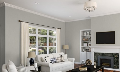
Edgecomb Gray HC-173 is considered as a warm gray color. Though it depends upon the color you are comparing with. But in most of cases, Edgecomb Gray HC-173 is found to be as warm gray paint. Do note that due to this, darker rooms that get little light, Edgecomb Gray HC-173 tends to look quite dark and dull.
Also, it appears slightly beiger than it does under such circumstances. In a well-lit room, however, you can expect Edgecomb Gray HC-173 to look brighter and lighter as the natural light tends to bounce off. Many consider Edgecomb Gray HC-173 as not too dark or not a too light shade of gray.
Usage of Edgecomb Gray HC-173
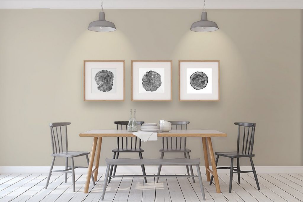
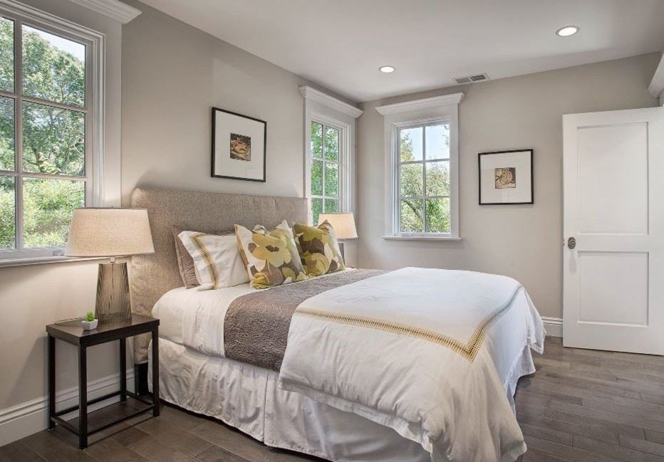
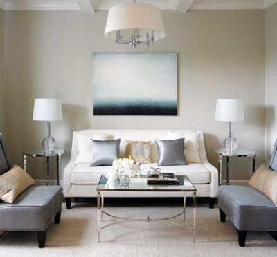
There is a reason why Edgecomb Gray HC-173 is famous. It is versatile and beautiful and can be practically used anywhere. We will investigate its three most critical applications.
Bedroom
If you want a neutral backdrop, then Edgecomb Gray HC-173 is a perfect choice. A neutral backdrop can be instrumental when you want a spotlight on other places such as artwork or paintings.
Exterior
If you decide to paint the exterior of your house in Edgecomb Gray HC-173, then you are most welcome as it is an incredible paint choice for your home’s exterior. Understand that this paint appears to be lighter than it does indoors.
The reason is that the paint is under the direct influence of sunlight. Do note that Edgecomb Gray HC-173 is a perfect option for the exterior only if you are looking for a neutral paint other than white.
Kitchen
It is the best place to use Edgecomb Gray HC-173. It provides a neutral backdrop so that you can bring the spotlight to any other place. Cabinets and walls are usually the best ones to be painted with Edgecomb Gray HC-173.
Comparisons of Edgecomb Gray HC-173 with Other Colors
The best way to understand color and its undertones is by comparing it with other colors.
Edgecomb Gray HC-173 vs. Revere Pewter
Revere Pewter is another famous and well-known Benjamin Moore paint. It is darker than Edgecomb Gray HC-173. Both the paints have green undertones and are complementary to each other.
Edgecomb Gray HC-173 vs. Light French Gray
Edgecomb Gray HC-173 is a warmer gray paint color as compared to Light French Gray.
Edgecomb Gray HC-173 vs. Agreeable Gray
Edgecomb Gray HC-173 is one of the most popular Benjamin Moore paint, while Agreeable Gray is the most popular Sherwin Williams paint. Edgecomb Gray HC-173 has more Beige than Agreeable Gray as grayer in it.
Edgecomb Gray HC-173 vs. Accessible Beige
Accessible Beige is warmer than Edgecomb Gray HC-173. Edgecomb Gray HC-173 has a green undertone while Accessible Beige has a gray undertone with more Beige than Edgecomb Gray HC-173.
Edgecomb Gray HC-173 vs Shaker Beige
Edgecomb Gray HC-173 is a lighter paint when compared to Shaker Beige.
Edgecomb Gray HC-173 vs. Glacier White
Edgecomb Gray HC-173 is a darker paint as compared to Glacier White.
Conclusion
Edgecomb Gray HC-173 is the best greige color available in the market. It is beautiful, versatile, and appealing to the masses. So, if conditions match, go for Edgecomb Gray HC-173 and do not forget to do sampling first.
Bonus Tip
The best trim color for Edgecomb Gray HC-173 is White Dove. Though it is not right for every case as trim color depends upon wall color too.

0 Comment
https://potofu.me/pd0v6d5u https://beta.cent.co/lost1587/+ln4aky https://gratisafhalen.be/author/lost1587/ https://www.bourse-du-sport.com/author/lost1587/ http://www.annunciogratis.net/author/lost1587