Sherwin Williams is an American company that sells and distributes paints to the American continent and Europe. They are especially famous for their wide range of color palettes. They have combined various colors and have found multiple shades, tones, and hues in each color. Edge comb Gray They even offers different variants in ‘greige,’ a combination of ‘Gray’ and ‘Beige.’ One of those greige shades is Repose Gray or also called Edge comb Gray.
Repose Gray
Edge comb Gray is a timeless color that gives out various feelings when looked at. For starters, its brownish touch makes it look a bit earthy that gives out a welcoming feel. It feels organic because of the Gray and brown combination, and the finish looks classy and high-end. Repose Gray or Edge comb Gray is for you if you are into futuristic or modern-looking paints.
Better than Off-whites!
When you want to have a light color and are against the idea of having a white wall, then you usually go for off-white shades. But, if you look at the shades that are lighter and closer to Gray, you can see how attractive and modern they look.
Off-whites are okay but have a dull tone to them. If you do not want white and something equally light and friendly, Edge comb Gray / Repose Gray is your only friend here. It has the least undertones of Gray than any other. It is one of those pure Gray tones!
Tones and Shades of Repose Gray
Reviews online state that it gave out some lavender or pink tones when coating the color, but it was not a big deal after the second coating or drying out totally. After the walls have dried up, the purplish undertones appeared no more, and it was more of beige in Gray than any shade of purple.
A few reviews said that the purple shades that appeared in the beginning slowly fade away. But the remnant shades of purple remain and appear on a bright summer day. These purples may fade away totally or stay slightly. Repose or Edge comb Gray is one of the Gray’s that does not fall into the more relaxed and monotonous shades of other Gray’s. Edge comb Gray falls under the rare side of warmer Gray’s.
As it is closer to beige and brown shades, it appears warmer than many other Gray shades. If one can draw a spectrum of all the Gray’s, this falls somewhere in the middle and belongs to the family of medium Gray’s.
It also gives out the shades of taupe. As the color belongs to brown a bit, it gives out the color taupe, which is a middle ground between Gray and brown. These taupe shades are the reason to give out the purple or violet-is tones. Surprisingly, the relation between beige, Gray, and brown makes the color give out shades and greens’ undertones.
The Light and Repose Gray?
The colors have a measure called Light Reflection Value. LRV is a scale to know about the reflection quality of the paint. LRV value of Repose Gray. How color is looked at depends upon the light it reflects.
A naturally lit room looks different than a dim room with the same color as the lit one. So, the brightness and intensity of a wall color depend upon the light falling on it.
The Edge comb Gray has shades as dark as brown and as light as white. When painted in a dark room when natural light doesn’t fall more, its shade gives a cold and desaturated feel. But the more lit the room is, the more saturated and warm the room looks.
The desaturated looks are because of the purples and blues in it. The warm look is because of the brown textures. Regardless of the light, Repose / Edge comb Gray is usually considered as a warm color.
Where to Paint?
To be precise, Repose Gray has a look to fit anywhere that it is painted, and there is no specific room that looks better than any other. It gives out a high-end classy feeling and suits automatically to any room. But after reading out many reviews and looking at people’s houses, it is best to look at which places the Edge comb Gray was painted.
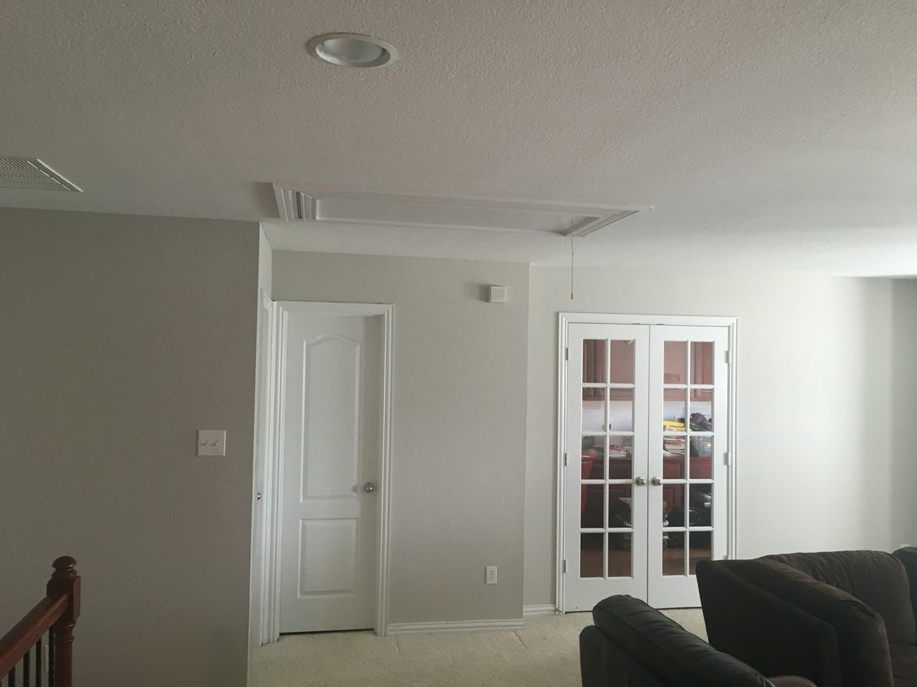
Kitchens
The cooling purple shades present in the Repose Gray gives a relaxed feel if the kitchen is placed in a room with moderate lighting.
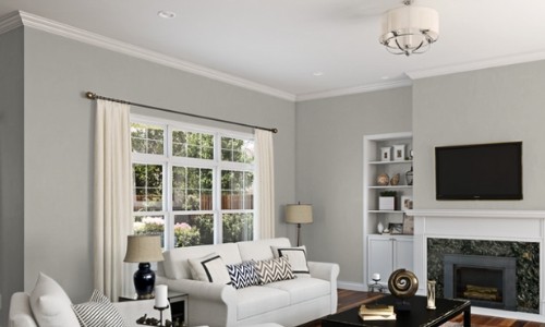
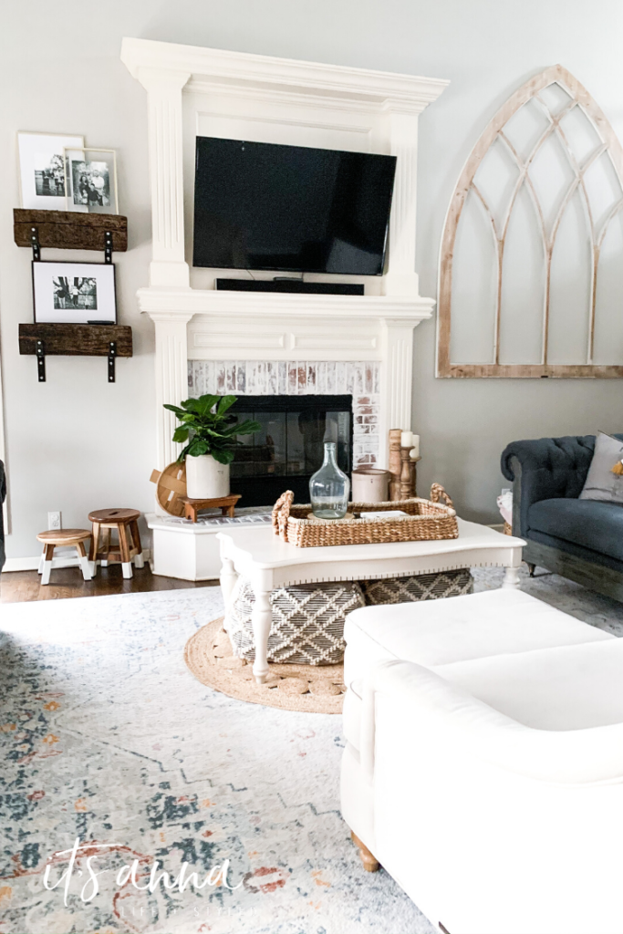
Living Room
Because of the warm browns, having Repose/ Edge comb Gray’s look welcoming, and the shades of mud present in color boost the friendly feeling.
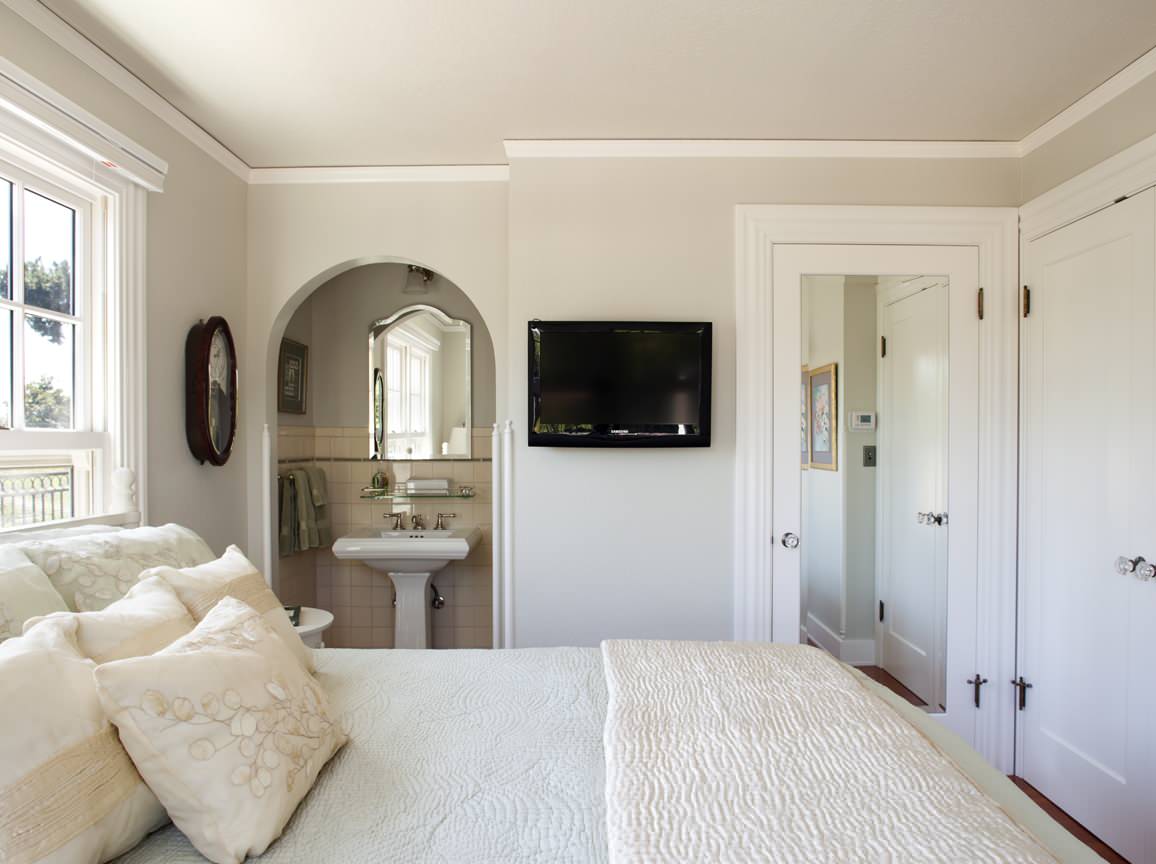
Bathrooms
A bathroom needs a color that does not get stained by hard water flow. Whites get easily stained and are hard to maintain. Off-whites are dull for a bathroom, and Repose Gray’s lavender shades give an aromatic feeling. Which perfectly suits any bathroom.
Decors
If you have Edge comb Gray or any other light colors, this versatile Gray shade appears fantastic in contrast to them. This contrast is precisely why having a decor or electronic item with Repose Gray looks impressive in a light-colored wall. Imagine the kitchen cabinets in repose Gray, and it looks modern and striking!
Modifying the Intensity
If you wanted this shade of Greige only because of its warmth, you could try to lighten it because the warmth of Repose Gray depends entirely upon the natural light. If any of your room does not have much natural light and you want the paint to be warm, you have a simple yet effective solution at your hands. You can buy white paint and mix it with the colour tint of Edge comb Gray you have. It lightens the colour and removes all the other dark and cool undertones.
This method helps to have a warm, naturally lit texture for a paint.
If you want to lighten the colour and increase shades of other colours in your paint, it is quite simple. It will help if you put a few drops of paint that you need, i.e., Repose Gray onto the brush. The lighter tones are prioritized, and the most popular colour chosen to lighten the colour is to add white.
One needs to remember mixing more drops of colour that are to be dominant. If cooler shade is what you are looking for, you need to mix darker shades with less Repose Gray. Similarly, if you are looking for warmth, you need to add a few drops of Gray and more drops of beige, brown, and other lighter shades. This lightening and darkening are a simple techniques to customize the tones of any color.
Neighbour’s
Using other Gray colours lighter or darker than the actual Edge comb, Gray also cuts the intensity down. Instead of using different additive colours, you can choose colours near the colour palette of repose Gray. There are many neighbors for grey, as there are still confusion and demands over the grey!
- Eider White is a colour closer to white and has Gray-is undertones, making it one of the brightest Gray shades ever.
- Dorian Gray is another brilliant neighbor of Repose Gray. It has more beige and looks more relaxed at the same time.
- Pavestone, the third color in the palette, is the beginning of the shades going towards beige and brown. It has more warmth and is more welcoming than Repose Gray.
- Riverway, the one below Pavestone, is where the Gray turns darker, colder, and has more greenish undertones
- Repose Gray is the optimal color that comprises all the other Gray; it is one of the substantial Gray’s.
A Few Reviews
“This is a beautiful shade of Gray! You are lucky to have an expert painter’s opinion! It took me literally months to pick out a Gray paint and finally landed on the Gray owl. I never realized how tricky Gray’s were until then!” – Dani
“I tried 50% Repose, and it gives me a blue tone feeling. Am I just imagining this, or can this happen when you lighten it down? The true repose does not feel blue at all. The 50% is catching me off guard now. What do you think?” – Kristi
The reviews gained mixed to positive opinions all over the internet. Everyone was happy because of the reasonable prices and the optimal Gray between all the Gray’s.
Final Words
Repose Gray is that ideal Gray, which can be used everywhere and anywhere. The only problem with this Gray is that the color gives out different undertones and shades in extra natural light settings.
You must customize the color by adding whites or blacks for the proper saturation you want. That is a heavy burden to take after purchasing a paint color.
Another drawback of repose Gray is not a fresh color that gives an energetic feeling.
It is welcoming and friendly, but it is still dull. To take the dullness out, one has to choose the lightning darkening method again. If you are up to Gray’s, then go for it! It is the best Gray available in all the other undertones of Gray!